Forest cover change in the Carpathians since 1985

There has been a lot of talk in recent months about how bad the deforestation problem is in Romania, especially related to the expansion of the Austrian company Schweighofer. Although there is a lot of chit-chat in the media and on the internet on the subject, data and facts are not that easy to find. Not that easy — unless you make a bit of an effort: it turns out that a massive dataset on forest cover change in Eastern Europe is available for download, thanks to scientists at the University of Maryland who have published a paper on the dataset in the journal Remote Sensing of Environment.

The dataset is based on Landsat imagery collected between 1985 and 2012 and has a pixel size of 30×30 meters. It can be downloaded from this website. I am especially interested in what’s going on in parts of the Carpathians, because that’s where I grew up and went on lots of hikes and through lots of adventures in the 1980s and early 1990s. What follows are a few screenshots that give an idea about what is possible to see with this data.

This first image shows the whole Carpathian – intra-Carpathian area. There are five colors that correspond to different histories of forest cover: black pixels are places without forest during the time of study; green is stable forest; blue is forest gain; red is forest loss; and purple is forest loss followed by forest gain [there are two additional categories in the data, but they are not very common in this area].

carpathian_area

The good news is that there is a lot of green in this map, which means that about 28.5% of the Carpathian area was continuously covered by forest since 1985. An additional 3.4% was without tree cover in 1985, but has gained forest cover since then. The forest is gone from 1.5% of the area; and 1.7% has lost and then regained tree cover.

If we zoom in to the ‘bend’ area, which is essentially the southeastern corner of Transylvania, Romania, it becomes more obvious that, although the big picture doesn’t look very bad, some places have been affected fairly significantly over the last three decades:

bend_area

The black, forest-free patches in the middle are young intramontane basins with no forest. Deforestation looks to be more of a problem in the the Ciuc/Csík and Gheorgheni/Gyergyó basins. Let’s have a closer look at the Csík Basin:

csik

A further zoom-in shows one of the areas with the most forest loss, the western side of the Harghita Mountains:

hargita

I am going to stop here; but this dataset has a lot more to offer than I showed in this post. The conclusion from this certainly shouldn’t be that everything is fine; often the issue is not so much the quantity of the forest being cut, but *where* it is being cut. Protected areas and national parks should clearly be green and stay green on these maps; and the Romanian Carpathians could use a few more protected lands, as many of these forests have never been cut (unlike a lot of forests in Western Europe).

I have used IPython Notebook with the GDAL package to create these images. The notebook can be viewed and downloaded over here.

Reference

P.V. Potapov, S.A. Turubanova, A. Tyukavina, A.M. Krylov, J.L. McCarty, V.C. Radeloff, M.C. Hansen, Eastern Europe’s forest cover dynamics from 1985 to 2012 quantified from the full Landsat archive, Remote Sensing of Environment, Volume 159, 15 March 2015, Pages 28-43, http://dx.doi.org/10.1016/j.rse.2014.11.027.

Rivers through time, as seen in Landsat images

Thanks to the Landsat program and Google Earth Engine, it is possible now to explore how the surface of the Earth has been changing through the last thirty years or so. Besides the obvious issues of interest, like changes in vegetation, the spread of cities, and the melting of glaciers, it is also possible to look at how rivers change their courses through time. You have probably already seen the images of the migrating Ucayali River in Peru, for example here. This river is changing its course with an impressive speed; many – probably most – other rivers don’t show much obvious change during the same 30-year period. What determines the meander migration rate of rivers is an interesting question in fluvial geomorphology.

The data that underlies Google Earth Engine is not accessible to everybody, but the Landsat data is available to anyone who creates a free account with Earth Explorer. It is not that difficult (but fairly time consuming) to download a set of images and create animations like this (click for higher resolution):

ucayali7

This scene also comes from the Ucayali River (you can view it in Google Earth Engine over here) and it is a nice example of how both neck cutoffs and chute cutoffs form. First a neck cutoff takes place that affects the tight bend in the right side of the image; this is followed by a chute cutoff immediately downstream of the neck cutoff location, as the new course of the river happens to align well with a pre-existing chute channel. The third bend in the upper left corner shows some well-developed counter-point-bar deposits. There is one frame in the movie for each year from 1985 to 2013, with a few years missing (due to low quality of the data).

Update (04/14/2016): If you want to use the animation, feel free to do so, as long as you (1) give credit to NASA/USGS Landsat, (2) give credit to me (= Zoltan Sylvester, geologist), and (3) link to this page. Note that you can see/download the high-resolution version if you click on the image.

Update (04/15/2016): Matteo Niccoli (who has a great blog called MyCarta) has created a slower version of the animation:

ucayali71_slow

Snorkeling and geology in Kealakekua Bay, Big Island, Hawaii

For a long time, I didn’t think it was worth spending more than an hour on a beach, even the most beautiful ones, unless there were some nice cliffs nearby showing some interesting geology. My views in this regard have changed dramatically about three years ago, when I spent a week on The Big Island of Hawaii, and the hotel where we were staying offered free rental of snorkeling gear. I put on the mask and the fins, trying to remember how this was supposed to work (I did a bit of snorkeling in Baja California many years before that), and put my face into the not-too-interesting-looking waters in the front of the hotel.

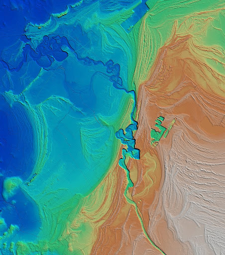
Kealakekua Bay in Google Earth, with some explanations added

I was in for a surprise. The water was far from crystal clear, but I could still see fantastic coral creations lined up along the bay and lots of fish of so many colors and patterns that it felt unreal. Until then I thought that this kind of scenery was hard to see unless you were a filmmaker working for Discovery Channel or a marine biologist specializing in tropical biodiversity. The next day I spotted a couple of green turtles frolicking in the water, clearly not bothered by the nearby snorkelers, and I already knew that I needed to look into the possibility of buying a simple underwater camera.

Lots of coral, mostly belonging to the genera Lobites (lobe coral) and Pocillopora (cauliflower coral)

Three years later I went back to the Big Island with more excitement about tropical beaches, plus bigger plans and a bit more knowledge about snorkeling. After going through a few well-known snorkeling sites on the west coast, like Kahalu’u Beach in Kona and Two Step near Pu’uhonua o Honaunau park, we got on a nice boat (run by a company called Fair Wind – strongly recommended!) and did some snorkeling in Kealakekua Bay.

Visibility in Kealakekua Bay is usually very good

Old wrinkles of pahoehoe lava getting encrusted by algae and corals and chewed up by sea urchins

Kealakekua Bay is difficult to reach; there is no road and no parking lot nearby. You either have to hike in, paddle through the bay in a kayak, or take a boat. I have heard before that this was the best snorkeling spot in Hawai’i, but I think that is an understatement. Unlike all the other spots we tried during the last few years in Hawaii (and that includes several beaches on Kauai and Hanauma Bay on Oahu, the presidential snorkeling site), the water at Kealakekua Bay was calm and very clear, with fantastic visibility.

Heads of cauliflower coral, with yellow tangs for scale

I will not attempt to describe this whole new world; instead I will let the photographs speak for themselves (as always, more photos at Smugmug). Even better, if you go to the Big Island, make sure that you visit this place with some snorkeling gear.

Yellow tangs (Zebrasoma flavescens) often congregate in large schools and it is difficult to stop taking pictures of them

When I was at Kealakekua Bay, I didn’t know much about the local geology. The big cliff bordering the bay toward the northwest, called Pali Kapu o Keoua (see image above), shows a number of layered lava flows that belong to the western flank of Mauna Loa; and I suspected that this must have been a large fault scarp, but that was the end of my geological insight. A couple of hours worth of research after I got home revealed that Pali Kapu o Keoua was a fault indeed: it is called the Kealakekua Fault and it has been mapped, along with the associated submarine geomorphological features, in the 1970s and 1980s by U.S. Geological Survey geoscientists.  It turns out that one of the shipboard scientists and key contributors to these studies was Bill Normark (see also a post about Bill at Clastic Detritus). While in California in the late 1990s, I was lucky to get to know Bill and have some truly inspiring discussions with him about turbidites, geology, and wine, so this was a doubly valuable little discovery to me.

So what is the origin of the Kealakekua Fault? The Hawaiian Islands are far away from any tectonic plate boundaries, so there is not a lot of opportunity here for inverse or strike-slip faults to develop. However, the Hawaiian volcanoes are humongous mountains and their underwater slopes are extremely steep by submarine slope standards: gradients of 15-10˚ are common. [This is in contrast by the way with the relatively gentle slopes of 3-8˚ the subaerial flanks of the volcanoes, a difference that – it just occurred to me – has to do something with the different thermal conductivities of water and air. Water is ~24 times more efficient at cooling lavas, or anything for that matter, than air, so once a volcano sticks its head out of the water, basaltic lava flows are pretty efficient at carrying volcanic material far away from the crater, thus building gently sloping shield volcanoes. The same flows are promptly solidified and stopped by the cool ocean waters as soon as they reach the coast.] Slopes that are this steep are also unstable; the underwater parts of these volcanoes tend to fail from time to time and large volumes of rock rapidly move to deeper waters as giant submarine landslides. Seafloor mapping around the islands revealed that the underwater topography is far from smooth; instead, in many places it consists of huge slide and slump blocks.

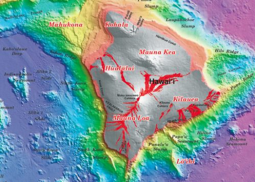
Topographic map of the Big Island. Note the location of Kealakekua Fault and the rugged seafloor to the southwest of it, marking the area affected by slides and slumps. This is a map based on higher-resolution bathymetric data collected during a collaborative effort led by JAMSTEC (Japan Marine Science and Technology Center). Source: U.S. Geological Survey Geologic Investigations Series I-2809 

Kealakekua Fault is probably part of the head scarp of one such giant landslide, called the Alika landslide. This explains the steep slopes in the bay itself: after a narrow wave-cut platform, a spectacular wall covered with coral – the continuation of the cliff that you can see onshore – dives into the deep blue of the ocean as you float away from the shore. In contrast with submarine landslides that involve well stratified sediments failing along bedding surfaces and forming relatively thin but extensive slide deposits, the Hawaiian failures affect thick stacks of poorly layered volcanic rock and, as a result, both their volumes and morphologic relief are larger (see the paper by Lipman et al, 1988). The entire volume of the Alika slide is estimated to be 1500-2000 cubic kilometers. That is about a hundred times larger than all the sediment carried by the world’s rivers to the ocean in one year! The slides have moved at highway speeds and generated tsunamis. There is evidence on Lanai island for a wave that carried marine debris to 325 meters above sea level; this tsunami was likely put in motion by the Alika landslide*.

You don’t want to be snorkeling in Kealakekua Bay when something like that happens. And it will happen again, it is a matter of (geological) time. Giant underwater landslides are part of the normal life of these mid-ocean, hotspot-related volcanoes.

Reference
Lipman, P., Normark, W., Moore, J., Wilson, J., Gutmacher, C., 1988, The giant submarine Alika debris slide, Mauna Loa, Hawaii. Journal of Geophysical Research, vol. 93, p. 4279-4299.

*tsunamis generated by landslides is a whole new exciting subject that we have no time now to dive or snorkel into.

Morphology of a forced regression

‘Forced regression’ is an important concept in sequence stratigraphy – it occurs when relative sea level falls and the shoreline shifts in a seaward direction, regardless of how much sediment is delivered to the sea. This is in contrast with ‘normal’ regressions, which take place when relative sea level doesn’t change or it is rising, but rivers bring lots of sediment to the coast and are able to push the shoreline seaward. These concepts are commonly illustrated with simple cartoons (like the ones on the SEPM sequence stratigraphy website), showing how beach deposits stack in a dip direction, and how their tops are eroded by rivers as sea level continues to fall.

Unless you live in a horizontally challenged flatland (vertical-land? 2D seismic-land?), real regressions happen in three dimensions, and their morphology is much more complicated, more interesting, and more beautiful than what one can dream up with a few lines in a single cross section. The example below is an airborne lidar image from Finland. The original data has a horizontal resolution of 2 meters and a vertical resolution of 30 centimeters.

Airborne lidar image of uplifted coastal plain in Finland
Image courtesy of Jouko Vanne, Geological Survey of Finland

The two dominant morphologies and deposit types clearly visible in the image are (1) ancient coastlines, formed as sand brought to the sea by rivers was reworked by waves into beach ridges; and (2) an incised river valley that cuts through these shoreline deposits. Note how the river seems to be incising and migrating laterally at the same time, generating a scalloped valley edge. The reason for this forced regression during a time of global sea-level rise is the isostatic rebound of the Scandinavian Peninsula after the retreat of the ice sheet.

Looking at this crystal-clear morphology, it is tempting to think that this area must look very interesting in Google Earth as well. It turns out that it doesn’t; this is actually a pretty heavily vegetated land, not too spectacular on conventional satellite imagery (see figure below). The laser rays of the lidar are able to see through the non-geomorphological ‘noise’ and show stunning geomorphological detail.

Comparison of satellite image from Google Earth with detail of lidar topography

To explore a higher resolution version of this image, and for additional lidar visualizations of similar beauty, check out Jouko Vanne’s Flickr site. The National Land Survey of Finland has started collecting this kind of data in 2008 and they are planning to cover the whole country with high-resolution DEMs within a few years.

A great way to spend taxpayer money, as far as I am concerned.

Deep-sea landscapes from the ice age

The upcoming edition of Accretionary Wedge is going to focus on geo-images. I was always fascinated by the beauty of landscapes and landforms, natural patterns and textures, as many of the posts on this blog can testify; that is one of the reasons why I became a geologist.

However, this time I want to show a different kind of geo-image. These are not usual photographs; they are pictures of landscapes that existed thousands or millions of years ago. The ‘photographer’ uses acoustic waves instead of light. Once the data is recorded, a whole lot of processing and editing is required to get a reasonable result. Most often it is not trivial to make sure that the final image indeed comes close to capturing one geological moment in time, and part of it is not hundreds of thousands or millions of years older than the rest. It is a bit like stacking vertically pictures that come from time-lapse photography, but parts of the older images are erased later and get replaced with pixels that belong to more recent shots.

I am talking about maps that come from three-dimensional seismic surveys, especially their shallower sections located near the seafloor. Using this kind of data, it is possible to reconstruct ancient landscapes through careful mapping. The result is never going to be perfect, or even comparable to present-day satellite imagery, on one hand due to the limited lateral and vertical resolution, and on the other hand due to the removal of significant parts of the stratigraphic record through erosion.

Still, it is amazing that it is possible to reconstruct for example how the Gulf of Mexico looked like during a glacial period. The images below come form the continental slope of the Gulf, and are buried a few hundred feet below the seafloor. This morphology most likely formed during a glacial period when rivers were crossing the exposed shelf and delivering sediment directly onto the upper slope.

source: Virtual Seismic Atlas

Two submarine channels are visible, both of them directly linked to a delta that was deposited at the shelf edge. Colors correspond to thickness: red is thick, blue is thin. The next image shows the surface underlying the channels; in this case, the topographic surface is draped with seismic amplitude:

source: Virtual Seismic Atlas

There are more images from this ancient landscape available at the Virtual Seismic Atlas, a great resource for geo-imagery in general (see this post at Clastic Detritus for more detail). It is best to view these ‘photographs’ at larger resolution (which is pretty big in this case!) — you can do that if you go to the VSA website.

Garmin Forerunner 110 GPS watch – a review

A couple of years ago I decided to take running a bit more seriously and to try to keep track of when, how much, and how fast I run. As a dedicated Apple-afficionado and beginner runner, the obvious choice was the Nike+ sensor (which you place in the sole of your shoe), coupled with an iPod Nano. I have been using this setup for about two years now, and I was fairly happy with it. It was easy to start using it, it definitely helped me run more and faster than before, and GPS units were just too big or too nerdy (even for me) to carry around on a Saturday morning run in the park.

However, it has always bugged me that the precision and accuracy of the Nike+ system was far from perfect, and I knew that GPS watches could do much better, not to mention that you can also put your run on a map. I caved in to the temptation a few days ago and ordered a Garmin Forerunner 110 GPS watch; here are some initial observations.


The Forerunner 110 is designed to be relatively small and simple, with limited functionality. In other words, it is targeting people like me: mostly outdoor runners (it is not very good for biking and useless for indoor running) who don’t need all kinds of functionalities that most other Garmin GPS watches have. It gives you basic information like pace, time, distance, and heart rate (if you are using it with a heart rate monitor), and that’s about it. The relatively small size and reasonably good (=minimalistic) look means that you can wear this gadget on your wrist pretty much every day, without looking like a total nerd.

In terms of usability, the Forerunner 110 does pretty well. It doesn’t rely on the touch interface that is built into the latest and greatest Garmin sports watches; instead, it has four large buttons that are easy to push when you want to — or not to push inadvertently when you don’t want to. This can be important in the middle of a sweaty run when you are not really in the mood for the subtleties of dealing with a sensitive touch interface. For example, I often have problems with the touch-wheel of the iPod nano. Recording a run basically comes down to (1) waiting until the watch gets a GPS fix; and (2) pushing the ‘start/stop’ button. In my limited experience, getting a GPS fix works pretty well and relatively fast, although it did take about 5 minutes the first couple of times. That is too much for a runner. Yesterday and today however it was much better, it locked on to the satellites in less than a minute.

So far so good. The one major issue I ran into was that, after a first recorded run, when I wanted to upload the data to the Garmin Connect website, I couldn’t get the watch to talk to my MacBook. It took lots of trial-and-error and one-and-a-half hours on the phone with the Garmin help desk to figure out that the charging clip that’s supposed to attach to the four exposed contacts on the back of the watch was not exactly where it should have been, despite the fact that the watch was charging (or it looked like it was charging anyway). This might be just a reflection of my limited intellectual capabilities, but I doubt that I am the only one who will run into this problem.

When it comes to uploading your workout data to a website for visualization and analysis, the Garmin ecosystem definitely leaves the Nike+ setup in the dust. The obvious advantage is the visualization of your runs in Google Maps. This is a major plus for a map-lover; but in addition to that, the Garmin Connect website makes it very easy to export the data and visualize it with Google Earth or any other software that can handle geospatial data. No export options exist for the runs you have recorded with the Nike+ sensor. In addition, the quality and usability of the Garmin graphs showing pace/speed through time is way better than the flashy but largely useless attempt that Nike has put together. Compare these two graphs (representing the same run):

Nike+ website

Garmin Connect

The Nike+ graph is pretty close to useless, whereas the one from Garmin Connect looks like a plot based on real data and it shows real trends (e.g., that I was running significantly slower during the last half of the run). And this is not a reflection of poor data quality coming from the iPod software; it turns out that the resolution of that data is much better than what Nike shows you. In general, Garmin treats the workout data in a much more scientific yet simple manner, also giving you the options of taking the data elsewhere, whereas the Nike website is colorful and animated, but has limited and closed information that has been dumbed down too much for my taste.

To wrap it up, despite a few – hopefully short-lived – annoyances, I am fairly happy with this new gadget. I will try to find out later how well it can be used for geotagging photographs while hiking or doing field work, something I still don’t have a simple solution for.

Update (6/20/2010): I have been using this watch for more than a month now. It works pretty well for running, although I did have a problem today: it froze at one point, and I couldn’t record any new data. It was very hot and humid, and I guess the contacts on the back side of the watch couldn’t handle the amount of salty sweat I was producing. Now it works again. Also, it is a good idea to turn on the GPS reception a few minutes before you start the run because sometimes it still takes 2-3 minutes to get the coordinates.

In terms of using it for hiking and geotagging photographs: I did a hike using both this watch and an older Garmin unit, and noticed that the accuracy of theForerunner 110 is better than that of the Garmin eTrex Vista Cx. The watch worked much better in the forest and in a deep, narrow valley, where the GPS signal must have been weak. The problem is that the battery of the Forerunner 110 doesn’t last long enough for a full-day hike; after about 5 hours of constant GPS recording, I couldn’t use it any more.

Update (2/4/2011): It looks like this watch (certainly the one that I am using) has a major flaw: when connected to a computer, the USB connection is easily broken because of the questionable design of the contacts on the back of the watch and the clip. The watch freezes and the only way I could get it back to life was to do a hard reset. This means that any data you have on the watch is lost. I have lost running data due to this issue several times; the last time it was especially annoying since it successfully got rid of the GPS record of my first marathon. Thanks, Garmin!

Update (3/30/2012): The problem I mentioned in the update above hasn’t occurred since I did a software update. However, a few months ago (about one and a half years after I bought the watch) the strap broke and I don’t think there is an easy way to replace it. Also, often (but not always) it takes 20-30 minutes to get a GPS lock. It is time to get a new watch, and I think I will stay away from Garmin for now.