Exploring (de)compaction with Python

All clastic sediments are subject to compaction (and reduction of porosity) as the result of increasingly tighter packing of grains under a thickening overburden. Decompaction – the estimation of the decompacted thickness of a rock column – is an important part of subsidence (or geohistory) analysis. The following exercise is loosely based on the excellent basin analysis textbook by Allen & Allen (2013), especially their Appendix 56. You can download the Jupyter notebook version of this post from Github.

Import stuff

import numpy as np
import matplotlib.pyplot as plt
import functools
from scipy.optimize import bisect
%matplotlib inline
%config InlineBackend.figure_format = 'svg'
plt.rcParams['mathtext.fontset'] = 'cm'

Posing the problem

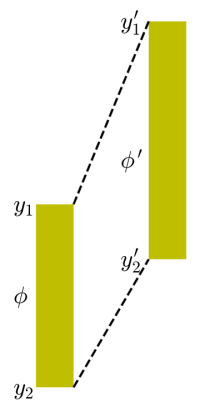
Given a sediment column of a certain lithology with its top at y_1 and its base at y_2, we are trying to find the thickness and average porosity of the same sediment column at a different depth (see figure below). We are going to set the new top y_1' and work towards finding the new base y_2'.

plt.figure(figsize=(2,5))
x = [0,1,1,0,0]
y = [1,1,1.5,1.5,1]
plt.text(-0.6,1.02,'$y_1$',fontsize=16)
plt.text(-0.6,1.52,'$y_2$',fontsize=16)
plt.text(-0.6,1.27,'$\phi$',fontsize=16)
plt.fill(x,y,'y')
x = [3,4,4,3,3]
y = [0.5,0.5,1.15,1.15,0.5]
plt.text(2.25,0.52,'$y_1\'$',fontsize=16)
plt.text(2.25,1.17,'$y_2\'$',fontsize=16)
plt.text(2.25,0.9,'$\phi\'$',fontsize=16)
plt.fill(x,y,'y')
plt.plot([1,3],[1,0.5],'k--')
plt.plot([1,3],[1.5,1.15],'k--')
plt.gca().invert_yaxis()
plt.axis('off');

decompaction1

Porosity decrease with depth

Porosity decreases with depth, initially largely due to mechanical compaction of the sediment. The decrease in porosity is relatively large close to the seafloor, where sediment is loosely packed; the lower the porosity, the less room there is for further compaction. This decrease in porosity with depth is commonly modeled as a negative exponential function (Athy, 1930):

\phi(y) = \phi_0 e^{-\frac{y}{y_0}}

where \phi(y) is the porosity at depth y and y_0 is the depth where the initial porosity \phi_0 was reduced by 1/e.

This is an empirical equation, as there is no direct physical link between depth and porosity; compaction and porosity reduction are more directly related to the increase in effective stress under a thicker overburden. Here we only address the simplest scenario with no overpressured zones. For normally pressured sediments, Athy’s porosity-depth relationship can be expressed in a slightly different form:

\phi(y) = \phi_0 e^{-cy}

where c is a coefficient with the units km^{-1}. The idea is that c is a characteristic constant for a certain lithology and it can measured if porosity values are available from different depths. Muds have higher porosities at the seafloor than sands but they compact faster than sands. The plot below show some typical curves that illustrate the exponential decrease in porosity with depth for sand and mud. The continuous lines correspond to the parameters for sand and mud in Appendix 56 of Allen & Allen (2013); the dashed lines are exponential fits to data from the Ocean Drilling Program (Kominz et al., 2011).

c_sand = 0.27 # porosity-depth coefficient for sand (km-1)
c_mud = 0.57 # porosity-depth coefficent for mud (km-1)
phi_sand_0 = 0.49 # surface porosity for sand
phi_mud_0 = 0.63 # surface porosity for mud
y = np.arange(0,3.01,0.01)

phi_sand = phi_sand_0 * np.exp(-c_sand*y)
phi_mud = phi_mud_0 * np.exp(-c_mud*y)

plt.figure(figsize=(4,7))
plt.plot(phi_sand,y,'y',linewidth=2,label='sand')
plt.plot(phi_mud,y,'brown',linewidth=2,label='mud')
plt.xlabel('porosity')
plt.ylabel('depth (km)')
plt.xlim(0,0.65)
plt.gca().invert_yaxis()

c_sand = 1000/18605.0 # Kominz et al. 2011 >90% sand curve
c_mud = 1000/1671.0 # Kominz et al. 2011 >90% mud curve
phi_sand_0 = 0.407 # Kominz et al. 2011 >90% sand curve
phi_mud_0 = 0.614 # Kominz et al. 2011 >90% mud curve
phi_sand = phi_sand_0 * np.exp(-c_sand*y)
phi_mud = phi_mud_0 * np.exp(-c_mud*y)
plt.plot(phi_sand,y,'y--',linewidth=2,label='90% sand')
plt.plot(phi_mud,y,'--',color='brown',linewidth=2,label='90% mud')
plt.legend(loc=0, fontsize=10);

decompaction2

While the compaction trends for mud happen to be fairly similar in the plot above, the ones for sandy lithologies are very different. This highlights that porosity-depth curves vary significantly from one basin to another, and are strongly affected by overpressures and exhumation. Using local data and geological information is critical. As Giles et al. (1998) have put it, “The use of default compaction curves can introduce significant errors into thermal history and pore- fluid pressure calculations, particularly where little well data are available to calibrate the model.” To see how widely – and wildly – variable compaction trends can be, check out the review paper by Giles et al. (1998).

Deriving the general decompaction equation

Compacting or decompacting a column of sediment means that we have to move it along the curves in the figure above. Let’s consider the volume of water in a small segment of the sediment column (over which porosity does not vary a lot):

dV_w = \phi dV_t

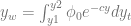
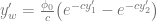
As we have seen before, porosity at depth y is

\phi(y) = \phi_0 e^{-cy}

The first equation then becomes

dV_w = \phi_0 e^{-cy} dV_t

But

dV_w = A dy_w

and

dV_t = A dy_t

where y_w and y_t are the thicknesses that the water and total volumes occupy respectively, and A is the area of the column we are looking at. So the relationship is equivalent to

dy_w = \phi_0 e^{-cy} dy_t

If we integrate this over the interval y_1 to y_2 we get

y_w = \int_{y1}^{y2} \phi_0 e^{-cy} dy_t

Integrating this yields

y_w = \phi_0 \Bigg(\frac{1}{-c}e^{-cy_2} - \frac{1}{-c}e^{-cy_1}\Bigg) = \frac{\phi_0}{c} \big(e^{-cy_1}-e^{-cy_2}\big)

As the total thickness equals the sediment thickness plus the water “thickness”, we get

y_s = y_t - y_w = y_2 - y_1 - y_w = y_2 - y_1 - \frac{\phi_0}{c} \big(e^{-cy_1}-e^{-cy_2}\big)

The decompacted value of y_w is

y_w' = \frac{\phi_0}{c} \big(e^{-cy_1'}-e^{-cy_2'}\big)

Now we can write the general decompaction equation:

y_2'-y_1' = y_s+y_w'

That is,

y_2'-y_1' = y_2 - y_1 - \frac{\phi_0}{c} \big(e^{-cy_1}-e^{-cy_2}\big) + \frac{\phi_0}{c} \big(e^{-cy_1'}-e^{-cy_2'}\big)

The average porosity at the new depth will be

\phi = \frac{Ay_w'}{Ay_t'} = \frac{\phi_0}{c}\frac{\big(e^{-cy_1'}-e^{-cy_2'}\big)}{y_2'-y_1'}

Write code to compute (de)compacted thickness

The decompaction equation could be solved in the ‘brute force’ way, that is, by gradually changing the value of y_2' until the right hand side (RHS) of the equation is the same as the left hand side (LHS) – see for example the Excel spreadsheet that accompanies Appendix 56 in Allen & Allen (2013). However, we (and scipy) can do better than that; we will use bisection, one the simplest optimization methods to find the root of the function that we set up as RHS-LHS.

# compaction function - the unknown variable is y2a
def comp_func(y2a,y1,y2,y1a,phi,c):
    # left hand side of decompaction equation:
    LHS = y2a - y1a
    # right hand side of decompaction equation:
    RHS = y2 - y1 - (phi/c)*(np.exp(-c*y1)-np.exp(-c*y2)) + (phi/c)*(np.exp(-c*y1a)-np.exp(-c*y2a))
    return LHS - RHS

Now we can do the calculations; here we set the initial depths of a sandstone column y_1,y_2 to 2 and 3 kilometers, and we estimate the new thickness and porosity assuming that the column is brought to the surface (y_1'=0).

c_sand = 0.27 # porosity-depth coefficient for sand (km-1)
phi_sand = 0.49 # surface porosity for sand
y1 = 2.0 # top depth in km
y2 = 3.0 # base depth in km
y1a = 0.0 # new top depth in km

One issue we need to address is that ‘comp_func’ six input parameters, but the scipy ‘bisect’ function only takes one parameter. We create a partial function ‘comp_func_1’ in which the only variable is ‘y2a’, the rest are treated as constants:

comp_func_1 = functools.partial(comp_func, y1=y1, y2=y2, y1a=y1a, phi=phi_sand, c=c_sand)
y2a = bisect(comp_func_1,y1a,y1a+3*(y2-y1)) # use bisection to find new base depth
phi = (phi_sand/c_sand)*(np.exp(-c_sand*y1)-np.exp(-c_sand*y2))/(y2-y1) # initial average porosity
phia = (phi_sand/c_sand)*(np.exp(-c_sand*y1a)-np.exp(-c_sand*y2a))/(y2a-y1a) # new average porosity

print('new base depth: '+str(round(y2a,2))+' km')
print('initial thickness: '+str(round(y2-y1,2))+' km')
print('new thickness: '+str(round(y2a-y1a,2))+' km')
print('initial porosity: '+str(round(phi,3)))
print('new porosity: '+str(round(phia,3)))

Write code to (de)compact a stratigraphic column with multiple layers

Next we write a function that does the depth calculation for more than one layer in a sedimentary column:

def decompact(tops,lith,new_top,phi_sand,phi_mud,c_sand,c_mud):
    tops_new = [] # list for decompacted tops
    tops_new.append(new_top) # starting value
    for i in range(len(tops)-1):
        if lith[i] == 0:
            phi = phi_mud; c = c_mud
        if lith[i] == 1:
            phi = phi_sand; c = c_sand
        comp_func_1 = functools.partial(comp_func,y1=tops[i],y2=tops[i+1],y1a=tops_new[-1],phi=phi,c=c)
        base_new_a = tops_new[-1]+tops[i+1]-tops[i]
        base_new = bisect(comp_func_1, base_new_a, 4*base_new_a) # bisection
        tops_new.append(base_new)
    return tops_new

Let’s use this function to decompact a simple stratigraphic column that consists of 5 alternating layers of sand and mud.

tops = np.array([1.0,1.1,1.15,1.3,1.5,2.0])
lith = np.array([0,1,0,1,0]) # lithology labels: 0 = mud, 1 = sand
phi_sand_0 = 0.49 # surface porosity for sand
phi_mud_0 = 0.63 # surface porosity for mud
c_sand = 0.27 # porosity-depth coefficient for sand (km-1)
c_mud = 0.57 # porosity-depth coefficent for mud (km-1)
tops_new = decompact(tops,lith,0.0,phi_sand_0,phi_mud_0,c_sand,c_mud) # compute new tops

Plot the results:

def plot_decompaction(tops,tops_new):
    for i in range(len(tops)-1):
        x = [0,1,1,0]
        y = [tops[i], tops[i], tops[i+1], tops[i+1]]
        if lith[i] == 0:
            color = 'xkcd:umber'
        if lith[i] == 1:
            color = 'xkcd:yellowish'
        plt.fill(x,y,color=color)
        x = np.array([2,3,3,2])
        y = np.array([tops_new[i], tops_new[i], tops_new[i+1], tops_new[i+1]])
        if lith[i] == 0:
            color = 'xkcd:umber'
        if lith[i] == 1:
            color = 'xkcd:yellowish'
        plt.fill(x,y,color=color)
    plt.gca().invert_yaxis()
    plt.tick_params(axis='x',which='both',bottom='off',top='off',labelbottom='off')
    plt.ylabel('depth (km)');

plot_decompaction(tops,tops_new)

decompaction3

Now let’s see what happens if we use the 90% mud and 90% sand curves from Kominz et al. (2011).

tops = np.array([1.0,1.1,1.15,1.3,1.5,2.0])
lith = np.array([0,1,0,1,0]) # lithology labels: 0 = mud, 1 = sand
c_sand = 1000/18605.0 # Kominz et al. 2011 >90% sand curve
c_mud = 1000/1671.0 # Kominz et al. 2011 >90% mud curve
phi_sand_0 = 0.407 # Kominz et al. 2011 >90% sand curve
phi_mud_0 = 0.614 # Kominz et al. 2011 >90% mud curve
tops_new = decompact(tops,lith,0.0,phi_sand_0,phi_mud_0,c_sand,c_mud) # compute new tops

plot_decompaction(tops,tops_new)

decompaction4

Quite predictably, the main difference is that the sand layers have decompacted less in this case.

That’s it for now. It is not that hard to modify the code above for more than two lithologies. Happy (de)compacting!

References

Allen, P. A., and Allen, J. R. (2013) Basin Analysis: Principles and Application to Petroleum Play Assessment, Wiley-Blackwell.

Athy, L.F. (1930) Density, porosity and compaction of sedimentary rocks. American Association Petroleum Geologists Bulletin, v. 14, p. 1–24.

Giles, M.R., Indrelid, S.L., and James, D.M.D., 1998, Compaction — the great unknown in basin modelling: Geological Society London Special Publications, v. 141, no. 1, p. 15–43, doi: 10.1144/gsl.sp.1998.141.01.02.

Kominz, M.A., Patterson, K., and Odette, D., 2011, Lithology Dependence of Porosity In Slope and Deep Marine Sediments: Journal of Sedimentary Research, v. 81, no. 10, p. 730–742, doi: 10.2110/jsr.2011.60.

Thanks to Mark Tingay for comments on ‘default’ compaction trends.

Cutoffs in submarine channels

A paper on sinuous submarine channels that is based on work I have done with Jake Covault (at the Quantitative Clastics Laboratory, Bureau of Economic Geology, UT Austin) has been recently published in the journal Geology (officially it will be published in the October issue, but it has been online for a few weeks now).

The main idea of the paper is simple: many submarine channels become highly sinuous and cutoff bends, similar to those observed in the case of rivers, must be fairly common. The more high-quality data becomes available from these systems, the more evidence there is that this is indeed the case. I think this observation is fairly interesting in itself, as cutoffs will add significant complexity to the three-dimensional structure of the preserved deposits. We have addressed that complexity to some degree in another paper. However, previous work on submarine channels has not dealt with the implications of how the along-channel slope changes as cutoff bends form.

So, inspired by a model of incising subaerial bedrock rivers, we have put together a numerical model that not only mimics the plan-view evolution of meandering channels, by keeping track of the x and y coordinates of the channel centerline, but it also records the elevations (z-values) at each control point along this line. The plan-view evolution is based on the simplest possible model of meandering, described in a fantastic paper by Alan Howard and Thomas Knutson published in 1984 and titled “Sufficient conditions for river meandering: A simulation approach“. The key idea is that the rate of channel migration is not only a function of local curvature (in the sense of larger curvatures resulting in larger rates of outer bank erosion and channel migration), but it also depends on the channel curvature upstream from the point of interest; and the strength of this dependence declines exponentially as you move upstream. Without this ‘trick’ there is no stable meandering. The model starts out with an (almost) straight line that has some added noise; meanders develop through time as a dominant wavelength gets established. The z-coordinates are assigned initially so that they describe a constant along-channel slope; as the sinuosity increases, the overall slope decreases and local variability appears as well, depending of the local sinuosity of the channel. More discrete changes take place at the time and location of a cutoff: this is essentially a shortcut that introduces a much steeper segment into the centerline. The animations below (same as two of the supplementary files that were published with the paper) show how the cutoffs form and how the along-channel slope profiles change through time.

sylvester_covault_submarine_channel

Animation of incising submarine channels with early meander cutoffs.


sylvester_covault_submarine_channel_profile

Evolution of along-channel gradient (top) and elevation profile (bottom) through time.

Meandering lowland rivers (like the Mississippi) have very low slopes to start with, so cutoff-related elevation drops are not as impressive as in the case of steep (with up to 40-50 m/km gradients) submarine channels (see diagram below). As a result, knickpoints that form this way in submarine channels are likely to be the locations of erosion and contribute to the stratigraphic complexity of the channel deposits. Previous work has shown that avulsion- and deformation-driven knickpoints are important in submarine channels; our results suggest that the meandering process itself can generate significant morphologic and stratigraphic along-channel variability.

screen-shot-2016-09-16-at-1-13-17-pm

Knickpoint gradient plotted against the overall slope. Dashed lines show trends for different cutoff distances (beta is the ratio between cutoff distance and channel width).

Finally I should mention that, apart from the seismic interpretation itself, we have done all the modeling, analysis, visualization, and plotting with Jupyter notebooks and Mayavi (for 3D visualization), using the Anaconda Python distribution. I cannot say enough good things about – and enough thanks for – these tools.

Stratigraphic patterns in slope minibasins

A few months ago some former colleagues and myself have published a paper on the stratigraphic evolution of minibasins that are present on many continental slopes (Sylvester, Z., Cantelli, A., and Pirmez, C., 2015, Stratigraphic evolution of intraslope minibasins: Insights from surface-based model: AAPG Bulletin, v. 99, no. 6, p. 1099–1129, doi: 10.1306/01081514082.) We used a simple model that investigates the interplay between subsidence and sedimentation and helps in the understanding of how stratal termination patterns relate to variations in sediment input and basin subsidence. Conventional sequence stratigraphy focuses on what is happening on the shelf and the shelf edge; and the origin of stratal patterns that characterize the typical ‘slug diagram’ are not trivial to relate to the three main parameters that influence continental-margin stratigraphy: changes in sea level, sediment supply, and subsidence. Our minibasin model is simpler because (1) it only has two parameters: sediment supply and subsidence (the impact of sea level – if any – is included in the sediment supply curve); and (2) sedimentary layers are deposited horizontally during each time step. The basic idea is to investigate the geometries of a system that consists of a depression that deepens through time and sediment is deposited in it with a certain rate. The figures that follow are color versions of the model cross sections that were published in the paper. The originals are actually interactive (you can zoom in and pan if you want to, which is useful if you want to check some details, especially along the basin margins). However, I could not get WordPress to display these in an interactive format; you can check out the interactive version of this post on Github. I have used the excellent, d3.js-based – and recently open-sourced – Plotly to create the interactive plots. A few brief comments follow so that the plots make some sense even if you don’t read the paper.

There are two types of layers in the model: (1) the ones that correspond to the sediment supply that comes into the basin from updip, mostly in the form of turbidity currents – these are shown in yellow color in the plots below; and (2) thinner ones that reflect an overall finer-grained background sedimentation – these are shown in brown color. The latter have a constant thickness across the basin. It is important to note that, while it is true that all the sand is supposed to be in the yellow units, not all of the yellow units are coarse-grained. In fact, slope minibsains have overall a much lower sand content than what a ‘yellow = sand’ assumption would imply in these plots. The blue dots are pinchout points, locations where the yellow layers terminate. In the paper we adopted the idea that ‘onlap’ refers to the case when these termination points move toward the basin edge, and ‘offlap’ corresponds to stratigraphic intervals where the pinchout locations migrate toward the center of the basin.

Sedimentary fills of slope minibasins commonly show strata that either converge toward or onlap onto the basin margins (or show a combination of the two). The first two cross sections are examples of ‘pure’ convergence and well-defined onlap. In the first case (convergence), both sediment input rate and subsidence are constant and have similar orders of magnitude, and, as a result, the locations where sedimentary layers terminate are stationary. The basin never gets very deep, as sedimentation keeps up with subsidence.

Screen Shot 2015-12-19 at 4.40.33 PM

Obviously animations are much better at conveying the idea of sedimentation taking place while the basin is subsiding (the background sedimentation is set to zero in the animation; the lower panel is a chronostratigraphic – or Wheeler – diagram):

movie_1_convergence

For the formation of onlap, a relatively deep basin and high sediment input are needed. The model below has the same overall sediment volume as the previous one, but it was deposited in half the time. Subsidence was kept constant, just like in the convergence model.

Screen Shot 2015-12-19 at 4.42.09 PM

And here is the animation for the onlap scenario:

movie_2_onlap

The next two plots illustrate what happens if the sediment input varies following a sinusoidal curve with three cycles, while subsidence is constant. In the first model, there is enough accommodation in the basin to keep all the sediment; in the second model, the sediment input exceeds the space available in the basin and each cycle has an upper part during which some of the sediment bypasses the basin. If you zoom in, you can see that both onlap and offlap are present in both cases.

Screen Shot 2015-12-19 at 4.44.14 PM

Screen Shot 2015-12-19 at 4.46.05 PM

And the animation for the no-bypass scenario:

movie_3_sinusoidal_input_no_bypass

Next we looked at what happens if sediment input is kept constant, but subsidence varies (following a sinusoidal function). It is tempting to think that the result must be similar to the case of variable sediment input and constant subsidence, but that is *not* the case. In  previous models onlap surfaces overlie condensed sections across the whole basin. In this new model, onlap surfaces are restricted to the basin margin and they correlate to sections with high sedimentation rate at the basin center.

Screen Shot 2015-12-19 at 4.46.51 PM

It is a cool idea that stratal patterns might tell you whether variability in sediment supply or deformation is more important. However, if both parameters are changing through time, with similar magnitudes, it is practically impossible to tell what is going on:

Screen Shot 2015-12-19 at 4.47.44 PM

This animation gives you an idea how can these two cases transition into each other, as sediment input goes from constant to sinusoidal and out-of-phase with subsidence:

movie_7_constant_to_out_of_phase_sediment_input

So far all the simulations were based on sinusoidally varying parameters; what happens though if sediment supply is closer to an ‘on-off’ function? You can see the result below: each sedimentary cycle only shows onlap, the offlapping upper part is missing.

Screen Shot 2015-12-19 at 4.48.35 PM

The next two plots are attempts to reproduce the stratal patterns seen in two well-studied minibasins in the Gulf of Mexico: Brazos-Trinity Basin 4 and the Auger Basin.

Screen Shot 2015-12-19 at 4.49.19 PM

Screen Shot 2015-12-19 at 4.50.08 PM

Finally, we looked at the common scenario of multiple linked minibasins, with sediment bypassing the updip basin serving as the sediment input for the basin downdip. The classic idea about this depositional setting is called ‘fill and spill’: the updip basin has to be filled first before any sediment gets into or spills the second basin. A ‘static’ version of this idea, with pre-formed basins and no subsidence during sedimentation, is illustrated in the plot below, with three sediment input cycles:

Screen Shot 2015-12-19 at 4.50.46 PM

The animated version looks like this:

movie_9_static_fill_and_spill

However, this static fill and spill is probably the exception rather than the rule: most minibasins keep subsiding while sedimentation is taking place. So, in contrast with the previous model, the large-scale fills of the basins are time-equivalent, while at the scale of individual sediment input cycles the fill-and-spill model still works.

Screen Shot 2015-12-19 at 4.50.58 PM

Now let’s animate this:

movie_10_dynamic_fill_and_spill

For more details on these models, see the paper in AAPG Bulletin. Ten related animations are open access and available on the AAPG website. And, again, the plots are a lot more interesting if you can zoom, pan and rescale, so you should really check out the intended format of this post.

Rivers through time, as seen in Landsat images

Thanks to the Landsat program and Google Earth Engine, it is possible now to explore how the surface of the Earth has been changing through the last thirty years or so. Besides the obvious issues of interest, like changes in vegetation, the spread of cities, and the melting of glaciers, it is also possible to look at how rivers change their courses through time. You have probably already seen the images of the migrating Ucayali River in Peru, for example here. This river is changing its course with an impressive speed; many – probably most – other rivers don’t show much obvious change during the same 30-year period. What determines the meander migration rate of rivers is an interesting question in fluvial geomorphology.

The data that underlies Google Earth Engine is not accessible to everybody, but the Landsat data is available to anyone who creates a free account with Earth Explorer. It is not that difficult (but fairly time consuming) to download a set of images and create animations like this (click for higher resolution):

ucayali7

This scene also comes from the Ucayali River (you can view it in Google Earth Engine over here) and it is a nice example of how both neck cutoffs and chute cutoffs form. First a neck cutoff takes place that affects the tight bend in the right side of the image; this is followed by a chute cutoff immediately downstream of the neck cutoff location, as the new course of the river happens to align well with a pre-existing chute channel. The third bend in the upper left corner shows some well-developed counter-point-bar deposits. There is one frame in the movie for each year from 1985 to 2013, with a few years missing (due to low quality of the data).

Update (04/14/2016): If you want to use the animation, feel free to do so, as long as you (1) give credit to NASA/USGS Landsat, (2) give credit to me (= Zoltan Sylvester, geologist), and (3) link to this page. Note that you can see/download the high-resolution version if you click on the image.

Update (04/15/2016): Matteo Niccoli (who has a great blog called MyCarta) has created a slower version of the animation:

ucayali71_slow

Exploring grain settling with Python

Grain settling is one of the most important problems in sedimentology (and therefore sedimentary geology), as neither sediment transport nor deposition can be understood and modeled without knowing what is the settling velocity of a particle of a certain grain size. Very small grains, when submerged in water, have a mass small enough that they reach a terminal velocity before any turbulence develops. This is true for clay- and silt-sized particles settling in water, and for these grain size classes Stokes’ Law can be used to calculate the settling velocity:

Screen Shot 2013-08-09 at 5.54.33 PM where R = specific submerged gravity (the density difference between the particle and fluid, normalized by fluid density), g = gravitational acceleration, D is the particle diameter, C1 is a constant with a theoretical value of 18, and the greek letter nu is the kinematic viscosity.

For grain sizes coarser than silt, a category that clearly includes a lot of sediment and rock types of great interest to geologists, things get more complicated. The reason for this is the development of a separation wake behind the falling grain; the appearance of this wake results in turbulence and large pressure differences between the front and back of the particle. For large grains – pebbles, cobbles – this effect is so strong that viscous forces become small compared to pressure forces and turbulent drag dominates; the settling velocity can be estimated using the empirical equation

Screen Shot 2013-08-09 at 5.54.40 PMThe important point is that, for larger grains, the settling velocity increases more slowly, with the square root of the grain size, as opposed to the square of particle diameter, as in Stokes’ Law.

Sand grains are small enough that viscous forces still play an important role in their subaqueous settling behavior, but large enough that the departure from Stokes’ Law is significant and wake turbulence cannot be ignored. There are several empirical – and fairly complicated – equations that try to bridge this gap; here I focus on the simplest one, published in 2004 in the Journal of Sedimentary Research (Ferguson and Church, 2004):

Screen Shot 2013-08-09 at 5.54.47 PM

At small values of D, the left term in the denominator is much larger than the one containing the third power of D, and the equation is equivalent of Stokes’ Law. At large values of D, the second term dominates and the settling velocity converges to the solution of the turbulent drag equation.

But the point of this blog post is not to give a summary of the Ferguson and Church paper; what I am interested in is to write some simple code and plot settling velocity against grain size to better understand these relationships through exploring them graphically. So what follows is a series of Python code snippets, directly followed by the plots that you can generate if you run the code yourself. I have done this using the IPyhton notebook, a very nice tool that allows and promotes note taking, coding, and plotting within one document. I am not going to get into details of Python programming and the usage of IPyhton notebook, but you can check them out here.

First we have to implement the three equations as Python functions:

import numpy as np
import matplotlib.pyplot as plt
rop = 2650.0 # density of particle in kg/m3
rof = 1000.0 # density of water in kg/m3
visc = 1.002*1E-3 # dynamic viscosity in Pa*s at 20 C
C1 = 18 # constant in Ferguson-Church equation
C2 = 1 # constant in Ferguson-Church equation
def v_stokes(rop,rof,d,visc,C1):
        R = (rop-rof)/rof # submerged specific gravity
        w = R*9.81*(d**2)/(C1*visc/rof)
        return w
def v_turbulent(rop,rof,d,visc,C2):
        R = (rop-rof)/rof
        w = (4*R*9.81*d/(3*C2))**0.5
        return w
def v_ferg(rop,rof,d,visc,C1,C2):
        R = (rop-rof)/rof
        w = ((R*9.81*d**2)/(C1*visc/rof+
            (0.75*C2*R*9.81*d**3)**0.5))
        return w

Let’s plot these equations for a range of particle diameters:

d = np.arange(0,0.0005,0.000001)
ws = v_stokes(rop,rof,d,visc,C1)
wt = v_turbulent(rop,rof,d,visc,C2)
wf = v_ferg(rop,rof,d,visc,C1,C2)
figure(figsize=(10,8))
plot(d*1000,ws,label='Stokes',linewidth=3)
plot(d*1000,wt,'g',label='Turbulent',linewidth=3)
plot(d*1000,wf,'r',label='Ferguson-Church',linewidth=3)
plot([0.25, 0.25],[0, 0.15],'k--')
plot([0.25/2, 0.25/2],[0, 0.15],'k--')
plot([0.25/4, 0.25/4],[0, 0.15],'k--')
text(0.36, 0.11, 'medium sand', fontsize=13)
text(0.16, 0.11, 'fine sand', fontsize=13)
text(0.075, 0.11, 'v. fine', fontsize=13)
text(0.08, 0.105, 'sand', fontsize=13)
text(0.01, 0.11, 'silt and', fontsize=13)
text(0.019, 0.105, 'clay', fontsize=13)
legend(loc=2)
xlabel('grain diameter (mm)',fontsize=15)
ylabel('settling velocity (m/s)',fontsize=15)
axis([0,0.5,0,0.15]);
D = [0.068, 0.081, 0.096, 0.115, 0.136, 0.273,
    0.386, 0.55, 0.77, 1.09, 2.18, 4.36]
w = [0.00425, 0.0060, 0.0075, 0.0110, 0.0139, 0.0388,
    0.0551, 0.0729, 0.0930, 0.141, 0.209, 0.307]
scatter(D,w,50,color='k')
show()

settling1

The black dots are data points from settling experiments performed with natural river sands (Table 2 in Ferguson and Church, 2004). It is obvious that the departure from Stokes’ Law is already significant for very fine sand and Stokes settling is completely inadequate for describing the settling of medium sand.

This plot only captures particle sizes finer than medium sand; let’s see what happens as we move to coarser sediment. A log-log plot is much better for this purpose.

d = np.arange(0,0.01,0.00001)
ws = v_stokes(rop,rof,d,visc,C1)
wt = v_turbulent(rop,rof,d,visc,C2)
wf = v_ferg(rop,rof,d,visc,C1,C2)
figure(figsize=(10,8))
loglog(d*1000,ws,label='Stokes',linewidth=3)
loglog(d*1000,wt,'g',label='Turbulent',linewidth=3)
loglog(d*1000,wf,'r',label='Ferguson-Church',linewidth=3)
plot([1.0/64, 1.0/64],[0.00001, 10],'k--')
text(0.012, 0.0007, 'fine silt', fontsize=13,
    rotation='vertical')
plot([1.0/32, 1.0/32],[0.00001, 10],'k--')
text(0.17/8, 0.0007, 'medium silt', fontsize=13,
    rotation='vertical')
plot([1.0/16, 1.0/16],[0.00001, 10],'k--')
text(0.17/4, 0.0007, 'coarse silt', fontsize=13,
    rotation='vertical')
plot([1.0/8, 1.0/8],[0.00001, 10],'k--')
text(0.17/2, 0.001, 'very fine sand', fontsize=13,
    rotation='vertical')
plot([0.25, 0.25],[0.00001, 10],'k--')
text(0.17, 0.001, 'fine sand', fontsize=13,
    rotation='vertical')
plot([0.5, 0.5],[0.00001, 10],'k--')
text(0.33, 0.001, 'medium sand', fontsize=13,
    rotation='vertical')
plot([1, 1],[0.00001, 10],'k--')
text(0.7, 0.001, 'coarse sand', fontsize=13,
    rotation='vertical')
plot([2, 2],[0.00001, 10],'k--')
text(1.3, 0.001, 'very coarse sand', fontsize=13,
    rotation='vertical')
plot([4, 4],[0.00001, 10],'k--')
text(2.7, 0.001, 'granules', fontsize=13,
    rotation='vertical')
text(6, 0.001, 'pebbles', fontsize=13,
    rotation='vertical')
legend(loc=2)
xlabel('grain diameter (mm)', fontsize=15)
ylabel('settling velocity (m/s)', fontsize=15)
axis([0,10,0,10])
scatter(D,w,50,color='k');
show()

settling3

This plot shows how neither Stokes’ Law, nor the velocity based on turbulent drag are valid for calculating settling velocities of sand-size grains in water, whereas the Ferguson-Church equation provides a good fit for natural river sand.

Grain settling is a special case of the more general problem of flow past a sphere. The analysis and plots above are all dimensional, that is, you can quickly check by looking at the plots what is the approximate settling velocity of very fine sand. That is great, but you would have to generate a new plot – and potentially do a new experiment – if you wanted to look at the behavior of particles in some other fluid than water. A more general treatment of the problem involves dimensionless variables; in this case these variables are the Reynolds number and the drag coefficient. The classic diagram for flow past a sphere is a plot of the drag coefficient against the Reynolds number. I will try to reproduce this plot, using settling velocities that come from the three equations above.

At terminal settling velocity, the drag force equals the gravitational force acting on the grain:

Screen Shot 2013-08-09 at 5.49.31 PM

We also know that the gravitational force is given by the submerged weight of the grain:

Screen Shot 2013-08-09 at 5.34.42 PM

The drag coefficient is essentially a dimensionless version of the drag force:

Screen Shot 2013-08-09 at 5.49.08 PM

At terminal settling velocity, the particle Reynolds number is

Screen Shot 2013-08-09 at 5.59.14 PM

Using these relationships it is possible to generate the plot of drag coefficient vs. Reynolds number:

d = np.arange(0.000001,0.3,0.00001)
C2 = 0.4 # this constant is 0.4 for spheres, 1 for natural grains
ws = v_stokes(rop,rof,d,visc,C1)
wt = v_turbulent(rop,rof,d,visc,C2)
wf = v_ferg(rop,rof,d,visc,C1,C2)
Fd = (rop-rof)*4/3*pi*((d/2)**3)*9.81 # drag force
Cds = Fd/(rof*ws**2*pi*(d**2)/8) # drag coefficient
Cdt = Fd/(rof*wt**2*pi*(d**2)/8)
Cdf = Fd/(rof*wf**2*pi*(d**2)/8)
Res = rof*ws*d/visc # particle Reynolds number
Ret = rof*wt*d/visc
Ref = rof*wf*d/visc
figure(figsize=(10,8))
loglog(Res,Cds,linewidth=3, label='Stokes')
loglog(Ret,Cdt,linewidth=3, label='Turbulent')
loglog(Ref,Cdf,linewidth=3, label='Ferguson-Church')
# data digitized from Southard textbook, figure 2-2:
Re_exp = [0.04857,0.10055,0.12383,0.15332,0.25681,0.3343,0.62599,0.77049,0.94788,1.05956,
       1.62605,2.13654,2.55138,3.18268,4.46959,4.92143,8.02479,12.28672,14.97393,21.33792,
       28.3517,34.55246,57.57204,78.3929,96.88149,159.92596,227.64082,287.31738,375.98547,
       516.14355,607.03827,695.8316,861.51953,1147.26099,1194.43213,1513.70166,1939.70557,
       2511.91235,2461.13232,3106.32397,3845.99561,4974.59424,6471.96875,8135.45166,8910.81543,
       11949.91309,17118.62109,21620.08203,28407.60352,36064.10156,46949.58594,62746.32422,
       80926.54688,97655.00781,122041.875,157301.8125,206817.7188,266273,346423.5938,302216.5938,
       335862.5313,346202,391121.5938,460256.375,575194.4375,729407.625]
Cd_exp = [479.30811,247.18175,199.24072,170.60068,112.62481,80.21341,45.37168,39.89885,34.56996,
       28.01445,18.88166,13.80322,12.9089,11.41266,8.35254,7.08445,5.59686,3.92277,3.53845,
       2.75253,2.48307,1.99905,1.49187,1.27743,1.1592,0.89056,0.7368,0.75983,0.64756,0.56107,
       0.61246,0.5939,0.49308,0.39722,0.48327,0.46639,0.42725,0.37951,0.43157,0.43157,0.40364,
       0.3854,0.40577,0.41649,0.46173,0.41013,0.42295,0.43854,0.44086,0.4714,0.45225,0.47362,
       0.45682,0.49104,0.46639,0.42725,0.42725,0.40171,0.31214,0.32189,0.20053,0.16249,0.10658,
       0.09175,0.09417,0.10601]
loglog(Re_exp, Cd_exp, 'o', markerfacecolor = [0.6, 0.6, 0.6], markersize=8)

# Reynolds number for golf ball:
rof_air = 1.2041 # density of air at 20 degrees C
u = 50 # velocity of golf ball (m/s)
d = 0.043 # diameter of golf ball (m)
visc_air = 1.983e-5 # dynamic viscosity of air at 20 degrees C
Re = rof_air*u*d/visc_air
loglog([Re, Re], [0.4, 2], 'k--')
text(3e4,2.5,'$Re$ for golf ball',fontsize=13)
legend(loc=1)
axis([1e-2,1e6,1e-2,1e4])
xlabel('particle Reynolds number ($Re$)', fontsize=15)
ylabel('drag coefficient ($C_d$)', fontsize=15);

cdvsre

The grey dots are experimental data points digitized from the excellent textbook by John Southard, available through MIT Open Courseware. As turbulence becomes dominant at larger Reynolds numbers, the drag coefficient converges to a constant value (which is equal to C2 in the equations above). Note however the departure of the experimental data from this ideal horizontal line: at high Reynolds numbers there is a sudden drop in drag coefficient as the laminar boundary layer becomes turbulent and the flow separation around the particle is delayed, that is, pushed toward the back; the separation wake becomes smaller and the turbulent drag decreases. Golf balls are not big enough to reach this point without some additional ‘help’; this help comes from the dimples on the surface of the ball that make the boundary layer turbulent and reduce the wake.

You can view and download the IPython notebook version of this post from the IPython notebook viewer site.

References
Ferguson, R. and Church, M. (2004) A simple universal equation for grain settling velocity. Journal of Sedimentary Research 74, 933–937.

My job description, in simple words

I couldn’t refrain from playing with the ‘upgoerfive’ tool, an online text editor that only allows you to use the one thousand most common words of the English language. Here is my attempt to describe what I do.

I study how small pieces of rock get together, move along, and settle down to form beds. Water usually moves smaller pieces further than large ones but lots of small and big pieces together can move really fast and build thick beds on the water bottom. I also look at the form of these beds and think about how much space is left in between the small pieces. This space is filled with water and sometimes with other stuff that people like to burn in their cars. It is nice that such beds are often seen in beautiful places around the world that I like to visit.

Here is the link to the original upgoerfive post. You can try it out yourself over here.

Camouflage in salt-and-pepper sediment, or how to hide on tropical beaches with nearby volcanoes

Here are three photos that demonstrate how well some animals ‘know’ the composition and grain size of the sediment of their homeland. In all three cases, the salt-and-pepper sand of the background is the result of dark-colored grains of volcanic origin mixing with light-colored fragments of corals and seashells.

Ghost crab on Big Island, Hawaii

Ghost crabs are common on many beaches around the world; below is another one from Costa Rica. Note how the different grain size and sediment color are perfectly captured by the crabs.

Ghost crab near Playa Conchal, Guanacaste, Costa Rica

The third example takes us back to Hawaii, under water, where I managed to get this shot of a flounder while snorkeling in Kona. The only reason I saw this guy was that I got really close and part of the seafloor, which later turned out to be the flatfish, unexpectedly took off.

Flowery flounder (Bothus mancus), Kahalu'u Beach Park, Big Island, Hawaii

The case for scales, rates, and numbers in geology

A long time ago I used to study geology in a nice city called Cluj, in the middle of that interesting part of Romania known as Transylvania. This was a place and time where and when I learned about quartz, feldspar, species of coral and foraminifera in great detail, heard about sequence stratigraphy and turbidites for the first time, and went on some great geological field trips. Not to mention the half-liter bottles of beer that would be significant components of any decent geological trip or spontaneous philosophical discussion in the evening. The less pleasant part was that many of the classes I took involved brute-force memorization of fossils, minerals, chronostratigraphic names, and formations. Although the geological vocabulary that I picked up was pretty broad and proved useful as a good set of words, terms, and definitions to play with, I forgot many of the details by now. If you asked me what was the difference between granite and granodiorite, I would have to check. I don’t remember at all what fossils are characteristic of the Late Jurassic. And, despite doing some fieldwork myself over there, I cannot remember the stratigraphic nomenclature in Transylvanian Basin; I would have to look it up (probably in this paper).

After college, it took me about one year to realize with convincing clarity that there was a lot left to learn. I went on to grad school on the other side of the planet, at a well-known university. Many of the classes I took over there were – unsurprisingly – quite different; a lot more focus on laws, processes and the connections between geological things than the ‘things’ themselves. It was also there that I started to see the links between geology and physics and math. I picked up quite a bit of math and physics during high school, but then quickly relegated them to the status of “stuff that is rarely used in geology”. At grad school, it dawned on me that numbers and mathematical laws are not only useful in geology, but are in fact necessary for doing good earth science. Maybe I am stating the obvious, but here it goes anyway: geology deals with enormous variations in scale, both in space and time; and it is not enough to say that the river was deep (how deep?), the tectonic deformation was fast (how fast?), the sea-level highstand lasted long (how long?), or the sediment gravity flows were high-energy flows (I am not even sure what that means). One of the most important things I learned was an appreciation for physical and quantitative insight in geology, that is, having at least an idea, a feel for what are the scales and rates involved in the formation of the rocks you are looking at. I cannot say it better than Chris Paola, one of the important and influential advocates of moving sedimentary geology closer to physics and math:

“For the ‘modal’ sedimentary-geology student, it is not sophisticated computational skills or training in advanced calculus that is lacking, but rather the routine application of basic quantitative reasoning. This means things like estimating scales and rates for key processes, knowing the magnitudes of basic physical properties, and being able to estimate the relative importance of various processes in a particular setting. Understanding scales, rates and relative magnitudes is to quantitative science what recognizing quartz and feldspar is to field geology. Neither requires years of sophisticated training, but both require repetition until they become habitual.”

Developing these skills is a lot easier if one is not afraid of tinkering with simple computer programs. Want to really understand what Stokes’ law is about? There is no better way than typing the equation into an Excel spreadsheet or a Matlab m-file and see how the plot of settling velocity against grain size looks like. What about settling in a fluid with different viscosity? Change the variable, and compare the result with the previous curve. High-level programming languages like Matlab or Python* are a lot easier to learn than languages closer to ‘computerese’ and farther from English, and they are great tools for these kinds of exercises and experiments. As somebody interested in stratigraphic architecture, I have become especially fond of creating surfaces that vaguely resemble real-world landscapes and then see how the evolution of these surfaces through time – deposition over here, erosion over there – creates stratigraphy. Complex three dimensional geometry is a lot easier to grasp if you can visualize and dissect it on the computer screen.

Of course, numbers, diagrams and images that come from computer programs are only useful if they demonstrably say something about the real world. Data collection in the field and the laboratory are equally important. But nowadays we often have more data than we wished for, and quantitative skills come handy for visualizing and analyzing large datasets – and comparing them to models.

Not everyone is excited about the growing number of earth scientists who tend to see equations ‘in the rocks’. The logo of the Sedimentology Research Group at the University of Minnesota features the Exner equation carved into a pebble, allegedly as a response to the exclamation “I haven’t seen yet an equation written on the rocks!” There is some concern that many geology graduates nowadays do not get to see, to map and to sample enough real rocks and sediments in the field. Although I think this unease is not entirely unsubstantiated, I wouldn’t want to sound as pessimistic as Emiliano Mutti – one of the founding fathers of deepwater sedimentology – does in the last phrase of a review article:

“This approach raises a problem, and not a small one: in connection with data collection in the field, how many field geologists are being produced in these times of increasingly computerized geology; and how good are they?”

As far as I know, geological field work is still an important part of the curriculum in many departments of geology – as it clearly should be. The number one reason I have become a geologist was that I loved mountains, hiking, and being outdoors in general, way before I started formally studying geology. And I still take every opportunity to go to the field. But I cannot see the growth of “computerized geology” – and of quantitative geology in general – as a bad thing. Does dry quantification take away the beauty and poetry of geology? I don’t think so. Unweaving the rainbow, unfolding a mountain, and reconstructing a turbidity current only add to our appreciation of the scale and grandeur of geology.

* I will let you know later whether this is true about Python…

** I have started writing this post for Accretionary Wedge #38, mostly because I found the call for posts quite inspiring, but haven’t finished it in time. Read all the good stuff at Highly Allochthonous.

Stretching the truth: vertical exaggeration of seismic data

ResearchBlogging.orgIf someone showed a photograph of the famous Cuernos massif (Torres del Paine National Park, Chile) like the one below, it would be – probably, hopefully – obvious to everybody that something is wrong with the picture. Our eyes and brains have seen enough mountain scenery that we intuitively know how steep is ‘steep’ in alpine landscapes. The peaks in this photograph just look too extreme, too high if one takes into account their lateral extent.

The Cuernos in Torres del Paine National Park, Chile, vertically exaggerated by a factor of two.

For comparison, here is the original shot:

The Cuernos, beautiful, without exaggeration.

Yet this kind of vertical stretching of images is the rule rather than the exception when displaying seismic sections, both on computer screens and in scientific papers. There are two main reasons for this: first, subsurface geometries are often more obvious when vertically stretched and slopes are larger than in real life. Second, more often than not, we have no precise knowledge of the actual vertical scale. Raw seismic reflection data is recorded in time: we are measuring how long it takes before a seismic wave propagates down to a discontinuity and comes back to the surface. This time measure is called ‘two-way traveltime’; in order to convert it to depth, knowledge of the velocity of sound through the rocks is needed:

depth = seismic_velocity * two-way_traveltime / 2
The problem is that the velocity of the wave varies as it goes deeper (usually increases with depth as rocks become ‘harder’); and, unless we are looking at perfect layercake stratigraphy (not that common!), it also changes laterally. So, if we want to look at the actual geological structures, without distortions due to varying velocities, we need to do a depth conversion and we need a ‘velocity model’ that roughly describes the spatial distribution of velocities. Precise velocity measurements often come from wells where depth is well known; less precise estimates can be backed out from the seismic recordings themselves, but the solution is often non-unique and multiple iterations are necessary to build a good velocity- and depth model. As a result, seismic reflection data is often interpreted with two-way traveltime on the vertical axis, without depth conversion; and not knowing the true vertical scale makes it easier to use vertical exaggeration with vengeance. 

A recent paper, published in Marine and Petroleum Geology, shows that vertical exaggeration of seismic data is indeed very common. Simon Stewart of Heriot-Watt University has looked through 1437 papers published between 2006-2010 and found that 75% of the papers show seismic displays with vertical exaggeration of a factor larger than 2. Only 12% are shown with roughly equal horizontal and vertical scales.

Histogram of vertical exaggerations in 1437 papers. From Stewart (2011).

One of the effects of vertical exaggeration is the strong steepening of dips. A 10 degree slope at a vertical exaggeration of 10 becomes an almost vertical drop of 60 degrees; it is hard not to think of these exaggerated slopes as steep slopes, even though they are not that abrupt in reality. Depositional geometries often have very small dips and significant vertical exaggeration is needed to illustrate the overall shapes.

The paper suggests that published seismic sections should be labeled with an estimate of the vertical exaggeration, in addition to the usual horizontal and vertical scales [I am guilty myself of not doing this as it should be done]. Even better, one can go further and create several versions of the figure with different vertical exaggerations. The cross section of a submarine lobe deposit below is a fine example of such a display. Showing only the version that was exaggerated vertically 25 times would suggest that this is a deposit at the base of a steep slope; the 1:1 figure at the top brings us back to reality and clearly shows that this morphology and stratigraphy are both extremely flat.

Dip section of a submarine lobe deposit, offshore Corsica. From Deptuck et al. (2008).

To see more about scales and vertical exaggeration in geology, check out this recent post at Highly Allochthonous; and the nice illustrations that Matt has put together over at Agile*.

References

Deptuck, M., Piper, D., Savoye, B., & Gervais, A. (2008). Dimensions and architecture of late Pleistocene submarine lobes off the northern margin of East Corsica Sedimentology, 55 (4), 869-898 DOI: 10.1111/j.1365-3091.2007.00926.x

Stewart, S. (2011). Vertical exaggeration of reflection seismic data in geoscience publications 2006–2010 Marine and Petroleum Geology, 28 (5), 959-965 DOI: 10.1016/j.marpetgeo.2010.10.003

Snorkeling and geology in Kealakekua Bay, Big Island, Hawaii

For a long time, I didn’t think it was worth spending more than an hour on a beach, even the most beautiful ones, unless there were some nice cliffs nearby showing some interesting geology. My views in this regard have changed dramatically about three years ago, when I spent a week on The Big Island of Hawaii, and the hotel where we were staying offered free rental of snorkeling gear. I put on the mask and the fins, trying to remember how this was supposed to work (I did a bit of snorkeling in Baja California many years before that), and put my face into the not-too-interesting-looking waters in the front of the hotel.

Kealakekua Bay in Google Earth, with some explanations added

I was in for a surprise. The water was far from crystal clear, but I could still see fantastic coral creations lined up along the bay and lots of fish of so many colors and patterns that it felt unreal. Until then I thought that this kind of scenery was hard to see unless you were a filmmaker working for Discovery Channel or a marine biologist specializing in tropical biodiversity. The next day I spotted a couple of green turtles frolicking in the water, clearly not bothered by the nearby snorkelers, and I already knew that I needed to look into the possibility of buying a simple underwater camera.

Lots of coral, mostly belonging to the genera Lobites (lobe coral) and Pocillopora (cauliflower coral)

Three years later I went back to the Big Island with more excitement about tropical beaches, plus bigger plans and a bit more knowledge about snorkeling. After going through a few well-known snorkeling sites on the west coast, like Kahalu’u Beach in Kona and Two Step near Pu’uhonua o Honaunau park, we got on a nice boat (run by a company called Fair Wind – strongly recommended!) and did some snorkeling in Kealakekua Bay.

Visibility in Kealakekua Bay is usually very good

Old wrinkles of pahoehoe lava getting encrusted by algae and corals and chewed up by sea urchins

Kealakekua Bay is difficult to reach; there is no road and no parking lot nearby. You either have to hike in, paddle through the bay in a kayak, or take a boat. I have heard before that this was the best snorkeling spot in Hawai’i, but I think that is an understatement. Unlike all the other spots we tried during the last few years in Hawaii (and that includes several beaches on Kauai and Hanauma Bay on Oahu, the presidential snorkeling site), the water at Kealakekua Bay was calm and very clear, with fantastic visibility.

Heads of cauliflower coral, with yellow tangs for scale

I will not attempt to describe this whole new world; instead I will let the photographs speak for themselves (as always, more photos at Smugmug). Even better, if you go to the Big Island, make sure that you visit this place with some snorkeling gear.

Yellow tangs (Zebrasoma flavescens) often congregate in large schools and it is difficult to stop taking pictures of them

When I was at Kealakekua Bay, I didn’t know much about the local geology. The big cliff bordering the bay toward the northwest, called Pali Kapu o Keoua (see image above), shows a number of layered lava flows that belong to the western flank of Mauna Loa; and I suspected that this must have been a large fault scarp, but that was the end of my geological insight. A couple of hours worth of research after I got home revealed that Pali Kapu o Keoua was a fault indeed: it is called the Kealakekua Fault and it has been mapped, along with the associated submarine geomorphological features, in the 1970s and 1980s by U.S. Geological Survey geoscientists.  It turns out that one of the shipboard scientists and key contributors to these studies was Bill Normark (see also a post about Bill at Clastic Detritus). While in California in the late 1990s, I was lucky to get to know Bill and have some truly inspiring discussions with him about turbidites, geology, and wine, so this was a doubly valuable little discovery to me.

So what is the origin of the Kealakekua Fault? The Hawaiian Islands are far away from any tectonic plate boundaries, so there is not a lot of opportunity here for inverse or strike-slip faults to develop. However, the Hawaiian volcanoes are humongous mountains and their underwater slopes are extremely steep by submarine slope standards: gradients of 15-10˚ are common. [This is in contrast by the way with the relatively gentle slopes of 3-8˚ the subaerial flanks of the volcanoes, a difference that – it just occurred to me – has to do something with the different thermal conductivities of water and air. Water is ~24 times more efficient at cooling lavas, or anything for that matter, than air, so once a volcano sticks its head out of the water, basaltic lava flows are pretty efficient at carrying volcanic material far away from the crater, thus building gently sloping shield volcanoes. The same flows are promptly solidified and stopped by the cool ocean waters as soon as they reach the coast.] Slopes that are this steep are also unstable; the underwater parts of these volcanoes tend to fail from time to time and large volumes of rock rapidly move to deeper waters as giant submarine landslides. Seafloor mapping around the islands revealed that the underwater topography is far from smooth; instead, in many places it consists of huge slide and slump blocks.

Topographic map of the Big Island. Note the location of Kealakekua Fault and the rugged seafloor to the southwest of it, marking the area affected by slides and slumps. This is a map based on higher-resolution bathymetric data collected during a collaborative effort led by JAMSTEC (Japan Marine Science and Technology Center). Source: U.S. Geological Survey Geologic Investigations Series I-2809 

Kealakekua Fault is probably part of the head scarp of one such giant landslide, called the Alika landslide. This explains the steep slopes in the bay itself: after a narrow wave-cut platform, a spectacular wall covered with coral – the continuation of the cliff that you can see onshore – dives into the deep blue of the ocean as you float away from the shore. In contrast with submarine landslides that involve well stratified sediments failing along bedding surfaces and forming relatively thin but extensive slide deposits, the Hawaiian failures affect thick stacks of poorly layered volcanic rock and, as a result, both their volumes and morphologic relief are larger (see the paper by Lipman et al, 1988). The entire volume of the Alika slide is estimated to be 1500-2000 cubic kilometers. That is about a hundred times larger than all the sediment carried by the world’s rivers to the ocean in one year! The slides have moved at highway speeds and generated tsunamis. There is evidence on Lanai island for a wave that carried marine debris to 325 meters above sea level; this tsunami was likely put in motion by the Alika landslide*.

You don’t want to be snorkeling in Kealakekua Bay when something like that happens. And it will happen again, it is a matter of (geological) time. Giant underwater landslides are part of the normal life of these mid-ocean, hotspot-related volcanoes.

Reference
Lipman, P., Normark, W., Moore, J., Wilson, J., Gutmacher, C., 1988, The giant submarine Alika debris slide, Mauna Loa, Hawaii. Journal of Geophysical Research, vol. 93, p. 4279-4299.

*tsunamis generated by landslides is a whole new exciting subject that we have no time now to dive or snorkel into.