Deep-sea landscapes from the ice age

The upcoming edition of Accretionary Wedge is going to focus on geo-images. I was always fascinated by the beauty of landscapes and landforms, natural patterns and textures, as many of the posts on this blog can testify; that is one of the reasons why I became a geologist.

However, this time I want to show a different kind of geo-image. These are not usual photographs; they are pictures of landscapes that existed thousands or millions of years ago. The ‘photographer’ uses acoustic waves instead of light. Once the data is recorded, a whole lot of processing and editing is required to get a reasonable result. Most often it is not trivial to make sure that the final image indeed comes close to capturing one geological moment in time, and part of it is not hundreds of thousands or millions of years older than the rest. It is a bit like stacking vertically pictures that come from time-lapse photography, but parts of the older images are erased later and get replaced with pixels that belong to more recent shots.

I am talking about maps that come from three-dimensional seismic surveys, especially their shallower sections located near the seafloor. Using this kind of data, it is possible to reconstruct ancient landscapes through careful mapping. The result is never going to be perfect, or even comparable to present-day satellite imagery, on one hand due to the limited lateral and vertical resolution, and on the other hand due to the removal of significant parts of the stratigraphic record through erosion.

Still, it is amazing that it is possible to reconstruct for example how the Gulf of Mexico looked like during a glacial period. The images below come form the continental slope of the Gulf, and are buried a few hundred feet below the seafloor. This morphology most likely formed during a glacial period when rivers were crossing the exposed shelf and delivering sediment directly onto the upper slope.

source: Virtual Seismic Atlas

Two submarine channels are visible, both of them directly linked to a delta that was deposited at the shelf edge. Colors correspond to thickness: red is thick, blue is thin. The next image shows the surface underlying the channels; in this case, the topographic surface is draped with seismic amplitude:

source: Virtual Seismic Atlas

There are more images from this ancient landscape available at the Virtual Seismic Atlas, a great resource for geo-imagery in general (see this post at Clastic Detritus for more detail). It is best to view these ‘photographs’ at larger resolution (which is pretty big in this case!) — you can do that if you go to the VSA website.

Garmin Forerunner 110 GPS watch – a review

A couple of years ago I decided to take running a bit more seriously and to try to keep track of when, how much, and how fast I run. As a dedicated Apple-afficionado and beginner runner, the obvious choice was the Nike+ sensor (which you place in the sole of your shoe), coupled with an iPod Nano. I have been using this setup for about two years now, and I was fairly happy with it. It was easy to start using it, it definitely helped me run more and faster than before, and GPS units were just too big or too nerdy (even for me) to carry around on a Saturday morning run in the park.

However, it has always bugged me that the precision and accuracy of the Nike+ system was far from perfect, and I knew that GPS watches could do much better, not to mention that you can also put your run on a map. I caved in to the temptation a few days ago and ordered a Garmin Forerunner 110 GPS watch; here are some initial observations.


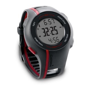
The Forerunner 110 is designed to be relatively small and simple, with limited functionality. In other words, it is targeting people like me: mostly outdoor runners (it is not very good for biking and useless for indoor running) who don’t need all kinds of functionalities that most other Garmin GPS watches have. It gives you basic information like pace, time, distance, and heart rate (if you are using it with a heart rate monitor), and that’s about it. The relatively small size and reasonably good (=minimalistic) look means that you can wear this gadget on your wrist pretty much every day, without looking like a total nerd.

In terms of usability, the Forerunner 110 does pretty well. It doesn’t rely on the touch interface that is built into the latest and greatest Garmin sports watches; instead, it has four large buttons that are easy to push when you want to — or not to push inadvertently when you don’t want to. This can be important in the middle of a sweaty run when you are not really in the mood for the subtleties of dealing with a sensitive touch interface. For example, I often have problems with the touch-wheel of the iPod nano. Recording a run basically comes down to (1) waiting until the watch gets a GPS fix; and (2) pushing the ‘start/stop’ button. In my limited experience, getting a GPS fix works pretty well and relatively fast, although it did take about 5 minutes the first couple of times. That is too much for a runner. Yesterday and today however it was much better, it locked on to the satellites in less than a minute.

So far so good. The one major issue I ran into was that, after a first recorded run, when I wanted to upload the data to the Garmin Connect website, I couldn’t get the watch to talk to my MacBook. It took lots of trial-and-error and one-and-a-half hours on the phone with the Garmin help desk to figure out that the charging clip that’s supposed to attach to the four exposed contacts on the back of the watch was not exactly where it should have been, despite the fact that the watch was charging (or it looked like it was charging anyway). This might be just a reflection of my limited intellectual capabilities, but I doubt that I am the only one who will run into this problem.

When it comes to uploading your workout data to a website for visualization and analysis, the Garmin ecosystem definitely leaves the Nike+ setup in the dust. The obvious advantage is the visualization of your runs in Google Maps. This is a major plus for a map-lover; but in addition to that, the Garmin Connect website makes it very easy to export the data and visualize it with Google Earth or any other software that can handle geospatial data. No export options exist for the runs you have recorded with the Nike+ sensor. In addition, the quality and usability of the Garmin graphs showing pace/speed through time is way better than the flashy but largely useless attempt that Nike has put together. Compare these two graphs (representing the same run):

Nike+ website

Garmin Connect

The Nike+ graph is pretty close to useless, whereas the one from Garmin Connect looks like a plot based on real data and it shows real trends (e.g., that I was running significantly slower during the last half of the run). And this is not a reflection of poor data quality coming from the iPod software; it turns out that the resolution of that data is much better than what Nike shows you. In general, Garmin treats the workout data in a much more scientific yet simple manner, also giving you the options of taking the data elsewhere, whereas the Nike website is colorful and animated, but has limited and closed information that has been dumbed down too much for my taste.

To wrap it up, despite a few – hopefully short-lived – annoyances, I am fairly happy with this new gadget. I will try to find out later how well it can be used for geotagging photographs while hiking or doing field work, something I still don’t have a simple solution for.

Update (6/20/2010): I have been using this watch for more than a month now. It works pretty well for running, although I did have a problem today: it froze at one point, and I couldn’t record any new data. It was very hot and humid, and I guess the contacts on the back side of the watch couldn’t handle the amount of salty sweat I was producing. Now it works again. Also, it is a good idea to turn on the GPS reception a few minutes before you start the run because sometimes it still takes 2-3 minutes to get the coordinates.

In terms of using it for hiking and geotagging photographs: I did a hike using both this watch and an older Garmin unit, and noticed that the accuracy of theForerunner 110 is better than that of the Garmin eTrex Vista Cx. The watch worked much better in the forest and in a deep, narrow valley, where the GPS signal must have been weak. The problem is that the battery of the Forerunner 110 doesn’t last long enough for a full-day hike; after about 5 hours of constant GPS recording, I couldn’t use it any more.

Update (2/4/2011): It looks like this watch (certainly the one that I am using) has a major flaw: when connected to a computer, the USB connection is easily broken because of the questionable design of the contacts on the back of the watch and the clip. The watch freezes and the only way I could get it back to life was to do a hard reset. This means that any data you have on the watch is lost. I have lost running data due to this issue several times; the last time it was especially annoying since it successfully got rid of the GPS record of my first marathon. Thanks, Garmin!

Update (3/30/2012): The problem I mentioned in the update above hasn’t occurred since I did a software update. However, a few months ago (about one and a half years after I bought the watch) the strap broke and I don’t think there is an easy way to replace it. Also, often (but not always) it takes 20-30 minutes to get a GPS lock. It is time to get a new watch, and I think I will stay away from Garmin for now.

Evapor-art from the Permian Castile Formation, west Texas

The Late Permian Castile Formation is a ~500 m thick accumulation of evaporites in west Texas and south-eastern New Mexico. Its most striking feature is the vast number of alternating thin layers of lighter- and darker-colored deposits, layers that seem to be continuous across most of the Delaware Basin. The white laminae are mostly gypsum and anhydrite; the darker layers consist of calcite and organic matter.


Most experts agree that these laminations reflect seasonal changes; that is, a pair of white and dark layers corresponds to one year. The thicker gypsum layer was deposited during the dry season; the thinner calcite layer with the organic material formed during the humid season when algae were more abundant and only carbonates could precipitate from the lower-salinity water [for more details, see this paper].


The image above gives an idea how laterally persistent these laminations can be; the two photographs come from cores that are 24 km (~15 miles) apart (source: Kirkland, D.W., 2003, An explanation for the varves of the Castile evaporites (Upper Permian), Texas and New Mexico, USA, Sedimentology 50, p. 899-920).

These evaporites are often affected by small-scale faulting and folding; the resulting patterns are quite variable and aesthetically pleasing (well, at least according to me). I shot these photos on a recent geological trip to Guadalupe Mountains National Park, in a roadcut near highway 180; more pictures here.

Texas wildflowers

The weather has been awesome around here lately (yes, in Houston!, the weather!, awesome!), and otherwise uninteresting roadside places are starting to be flooded with colors. Here are a few shots; more over at Smugmug.

This one is actually from 2008:

One of the issues with photographing flowers is that parts of the pictures are often out of focus, as it is obvious in this shot:


And a way to deal with that is to take a number of pictures that are focused at different distances and then merge them in Photoshop (as described in this video). This image was put together from four different photographs, and is a somewhat better version of the previous scene (the fact that the wind was pretty strong didn’t help):


Lunar Crater volcanic field, Nevada


I was on my way to San Francisco / AGU last week when I saw these volcanoes and shot these pictures through the airplane window. It turns out that this is the Lunar Crater volcanic field in Nevada, named after the largest crater that is more than 1000 meters across and about 130 m deep. There are 95 vents that are 4.2 million to 15,000 years old. Lunar Crater is the largest feature in the image below; it is a maar; most of the other vents formed cinder cones.


Here is a map showing the Houston – San Francisco flight track and the location of the volcanic field:

Hillslope diffusion

Modeling erosion and deposition of sediment using the diffusion equation is among the important subjects that are usually omitted from sedimentary geology textbooks. Part of the reason for this is that ‘conventional’ sedimentary geology tended to only pay lip service to earth surface processes and was more interested in describing the stratigraphic record than figuring how it relates to geomorphology. Nowadays, a good discussion of stratigraphy and sedimentology cannot ignore anymore what geomorphologists have learned about landscape evolution. (One textbook that clearly recognizes this is this one.)

But let’s get back to the subject of this post. Hillslope evolution can be modeled with the diffusion equation, one of the most common differential equations in science, applied for example to describe how differences in temperature are eliminated through heat conduction. In the case of heat, the heat flux is proportional to the rate of spatial temperature change; on hillslopes, the sediment flux is proportional to the spatial rate of change in elevation. This last quantity of course is the slope itself. In other words,

q = -k*dh/dx,

or

q = -k*slope,

where q is the volumetric sediment flux per unit length, k is a constant called diffusivity, h is the elevation, and x is the horizontal coordinate.

We also know that sediment does not disappear into thin air: considering a small area of the hillslope, the amount of sediment entering and leaving this area will determine how large the change in elevation will be:

dh/dt = -dq/dx,

in other words, deposition or erosion at any location is determined by the change in sediment flux.

Combining this equation with the previous one, we arrive to the diffusion equation:

dh/dt = k*d2h/dx2.

Note that the quantity on the right side is the second derivative (or curvature) of the slope profile. Large negative curvatures result in rapid erosion; places with large positive curvature have high rates of deposition. Through time, the bumps and troughs of the hillslope are smoothed out through erosion and deposition.

The simplest possible case is the diffusion of a fault scarp. The animation below illustrates how a 1 m high fault scarp gets smoothed out through time; the evolution of slope and curvature are also shown. The dashed line indicates the original topography, at time 0. [The plots were generated using Ramon Arrowsmith’s Matlab code].

More complicated slope profiles can be modeled as well; here is an example with two fault scarps:

Note how both erosion and deposition get much slower as the gradients become more uniform.

The simplicity of the diffusion equation makes it an attractive tool in modeling landscape evolution. In addition to hillslopes and fault scarps, it has been successfully applied in modeling – for example – river terraces, deltaic clinoforms, cinder cones, fluvial systems, and foreland basin stratigraphy. However, it is important to know when and where the assumptions behind it become invalid. For example, steep slopes often have a non-linear relationship between sediment flux and slope as mass movements dramatically increase sediment flux above a critical slope value. Also, the models shown here would fail to reproduce the topography of a system where not all sediment is deposited at the toe of the steeper slope, but a significant part is carried away by a river. And that brings us closer to advection; a subject that I might take notes about at another time.

Further reading: 1) The book “Quantitative Modeling of Earth Surface Processes” by Jon Pelletier has a chapter with lots of details about the diffusion equation. 2) Analog and numerical modeling of hillslope diffusion– a nice lab exercise.

Upcoming conference on seismic geomorphology

Ever since geoscientists and engineers started using seismic waves to figure out what lies under our feet, seismic reflection technology kept improving and today most oil-rich sedimentary basins have a wide coverage of high-quality three-dimensional datasets. In addition to finding structures and locations in the subsurface that are likely to be filled with hydrocarbons, these huge data volumes can also be used to reconstruct landscapes that are long gone from the Earth’s surface. After all, stratigraphy is what is left behind from an ever-changing topography, and it is a mistake to think that stratigraphy can be understood without knowing a few things about geomorphology and landscape evolution.

Seismic data confirms that the past, indeed, is not that different from the present: if you peek (that is, listen) into these volumes of rock, you see ancient meandering rivers and submarine channels, deltas, barrier islands, mouth bars, and estuaries. However, in addition to and beyond the excitement of seeing another beautiful example of a sinuous channel or other depositional and erosional features, a lot remains to be learned from the true and large-scale three-dimensionality of these datasets. For a geologist, there is no other data type that offers such a degree of three-dimensionality. Even the largest outcrops offer only random two-dimensional sections through a system; the temptation is strong to convince ourselves that we can extrapolate to get an idea about the third dimension, but more often than not we are probably wrong, at least in the details of our extrapolation. This is actually worse than the case of “The Blind Men and the Elephant“; it is more like the blind men and a random cut through the elephant (but I will stop this chain of analogies right there).

Long story short, I (re)started to blog about this subject because there is going to be an SEPM research conference in Houston, a conference that focuses on using three-dimensional seismic data to better understand how sediment moves or gets deposited on continental slopes. It should be an interesting collection of talks and papers.

The image above is from the conference website and announcement; it happens to come from a paper that I am going to present, on a shelf-edge delta and its related slope channels in the Gulf of Mexico (the higher-resolution version is coming soon…). Colors represent thickness (red is thick, blue means thin). There are two leveed channels taking sediment from the shelf-edge delta into the deep ocean.

Two gigapans from Cliffs of Moher, Ireland

I shot these gigapans recently, while we were visiting some deep-water rocks in County Clare, Ireland (see more detail on these rocks and a few photos from the trip). One afternoon we took some time off from the turbidites to do a bit of geo-tourism at the Cliffs of Moher, a series of spectacular escarpments along an 8 km long stretch of the western coast of Ireland. They are 702 feet (214 meters) high at the highest point and expose Late Carboniferous (Namurian) sandstones and shales that were mostly deposited as deltaic and fluvial sediments of the Tullig and Kilkee cyclothems.

This place is one of the most visited tourist attractions in Ireland, and for a good reason: the combination of the cliffs, the landscape, and abundant wildlife is, indeed, spectacular.

This is a view to the south (launch full screen viewer):
http://api.gigapan.org/beta/gigapans/27345/snapshots/87490,83479,83403,83402/iframe/flash.html

And this is a view to the north (from O’Brian’s Tower; launch full-screen viewer):
http://api.gigapan.org/beta/gigapans/27340/snapshots/83397,83395,83394,83392,83391/iframe/flash.html

Unfortunately, these stamp-sized windows do not do justice to the panoramas; it is a good idea to click on the “Launch full-screen viewer” links.